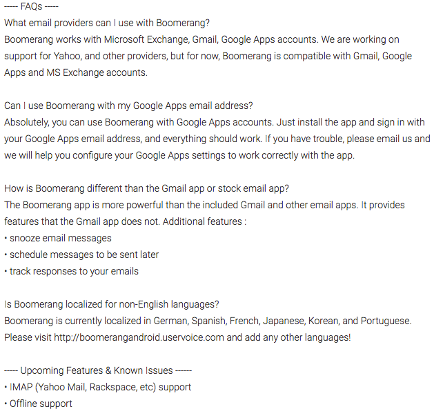
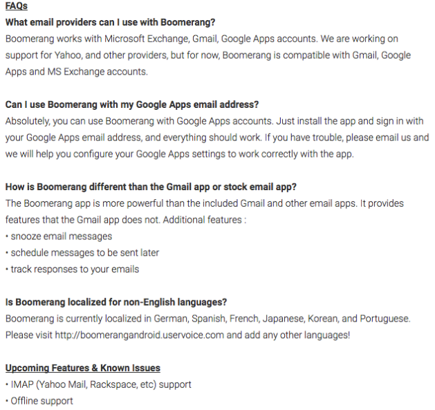
We had our Geico moment here at Boomerang last week, discovering that 5 minutes could improve Android app install rates by 15% or more (for us, it was more). When we added bold and underline formatting to our app’s existing Play Store description, our install rate increased significantly, even as we kept the copy, images, and everything else identical.
Though it’s not well-publicized, Android app descriptions support rich formatting (e.g., bold, italicized, and underlined text), as well as many non-standard characters like bullets. By adding a few simple HTML tags, users can emphasize important features, draw out header titles, and create a sleeker app description.
We figured we’d see how formatting Boomerang for Android’s Play Store listing would affect our install rates, if at all. We created an experiment (something Google introduced to the Play Store last year) to A/B test our English app description with and without rich formatting (but again, with nothing else changed!)

It took us all of five minutes to add a open and close a couple <b>, <u>, and <i> tags to help accentuate parts of our app description:
- We underlined (and bolded) each of our section headers (e.g., Features, FAQs).
- We bolded the questions in our FAQ section to differentiate them from their answers.
- We italicized quotes from media mentions.
- We emphasized important words like “Boomerang” and the start of our disclaimer that we aren’t affiliated with Google and Microsoft (although we appreciate their products!)

We knew that the formatting made the listing look nicer, but we were skeptical if it’d do anything to install rate. But just over a week later, we logged in to the Play Store console to find this:

This five minute tweak turned out to be a great investment, as Boomerang for Android’s install rate was 16% higher when visitors saw the rich formatted app description.We were excited at how much lift we got from such a simple Play Store optimization, but also surprised at how few apps take advantage of this trick. (At the time of writing, none of the top 10 grossing Play Store apps have rich formatting in their descriptions!)
Rich formatting doesn’t appear in too many app descriptions, though it should, so spread the word! It’s (literally) a bold strategy, Cotton, but one that does pay off.

Cool tip!
I just tried adding an experiment with a couple bold and italics tags around a few words but noticed that in the preview it shows as `…` etc.. (not actually formatted). Is that the way it is supposed to show up in the listing or am I doing something wrong here?
Thanks for the comment!
It doesn’t seem like Google Play provides any way to preview what the HTML tags/rich-formatting will look like until the updated description gets pushed live. If want to see how it will render without possible mistakes being visible to everyone, you can do an A/B experiment and give your HTML/rich-formatted variation as little traffic as possible. You can then view your rich-formatted variation once it goes live (though very few others will see it) and revert it back if it doesn’t look as expected. Hope this helps!